Urvil Soni

Sandwich House

Problem We Are Solving

Our platform caters to health enthusiasts and sandwich lovers, offering a diverse selection of sandwiches. With calorie tracking, users make informed choices. They can reserve tables, select timings, and pre-book parking. Upon arrival, they can seamlessly order food to their table. Our goal: streamline dining for satisfaction and convenience.

Our Goal

Our objective was to develop an intuitive application accessible to all users, enabling food enthusiasts to effortlessly locate, reserve, and manage tables and parking slots, while facilitating on-table food ordering. This goal aligns with our commitment to enhancing user experience and streamlining the dining process

Role

User research, Wire Framing, Low- Fidelity, prototypes, Usability Testing, Iterations, high-fidelity mock-ups

User Personas

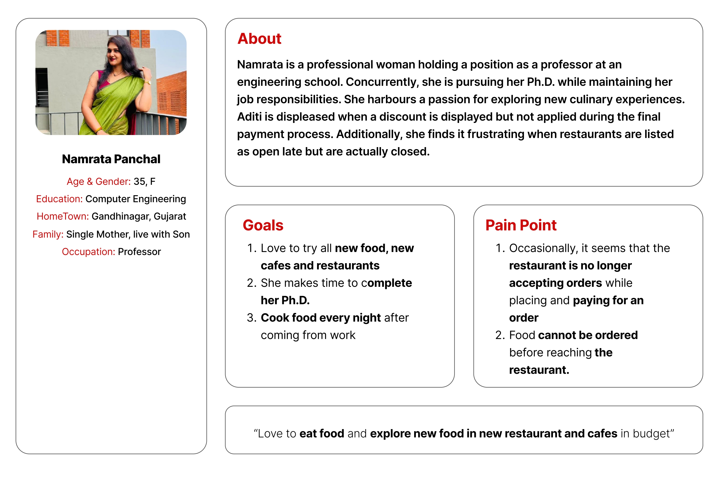
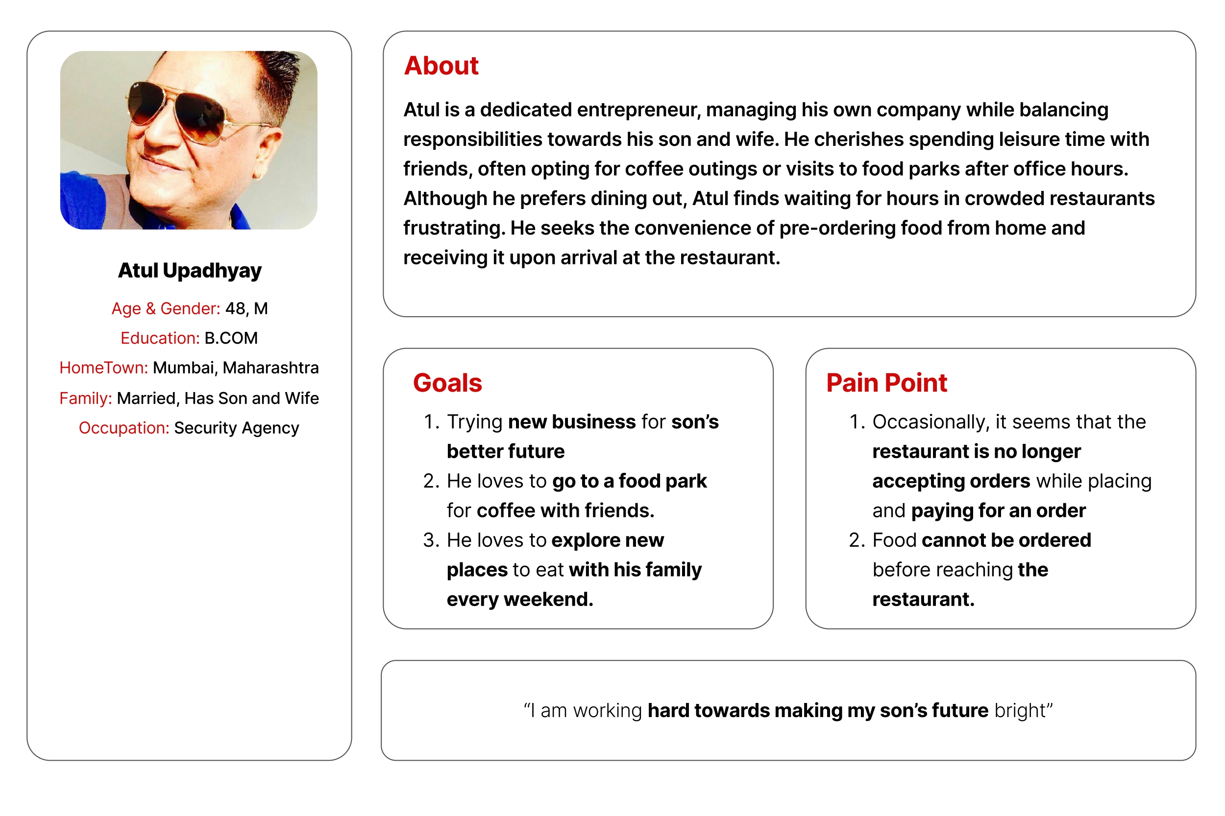
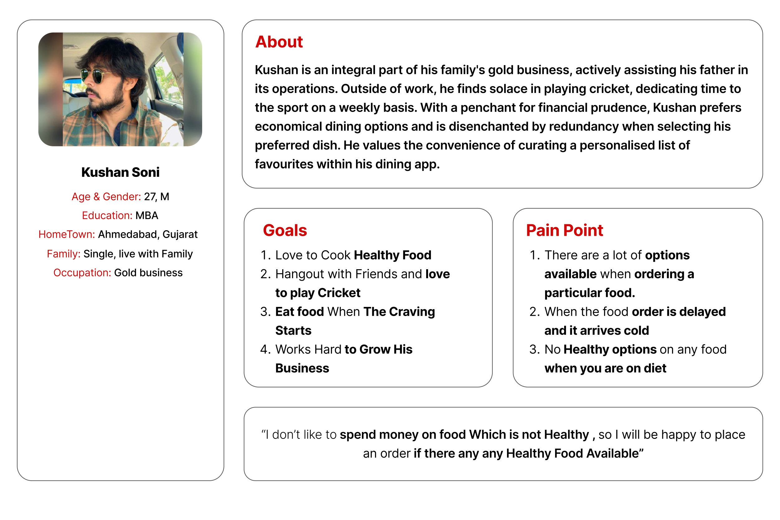
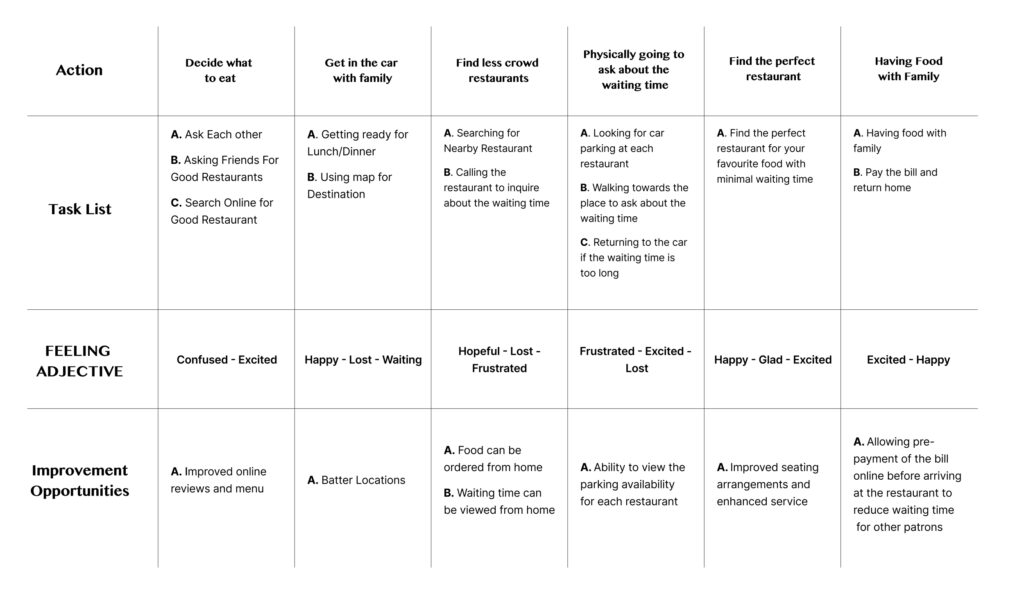
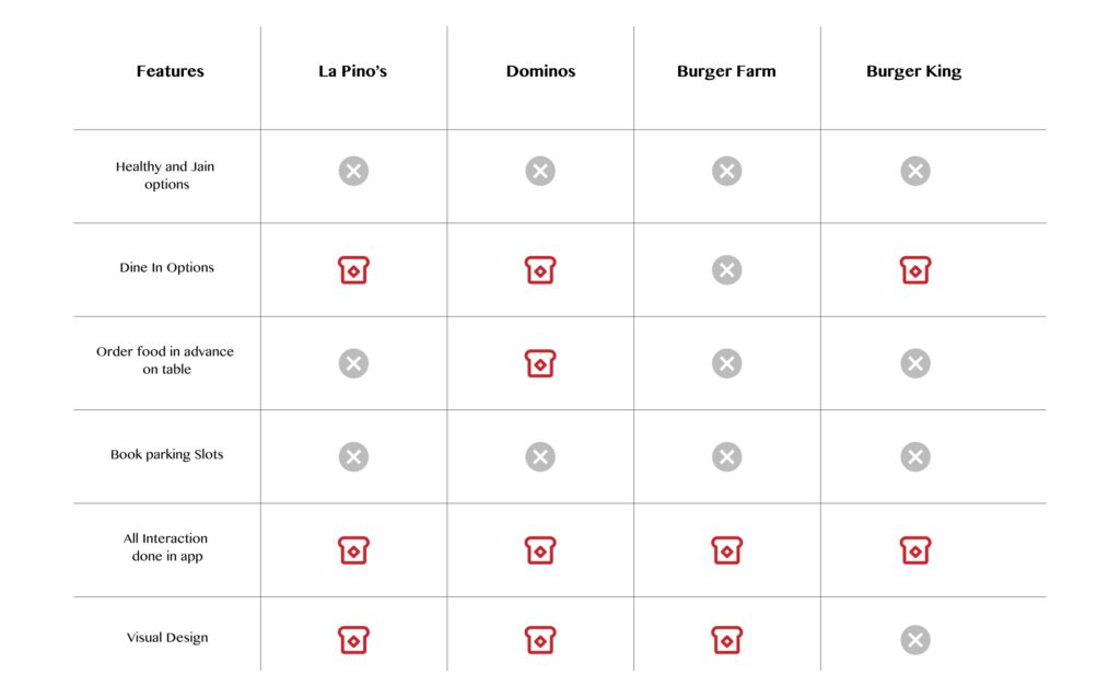
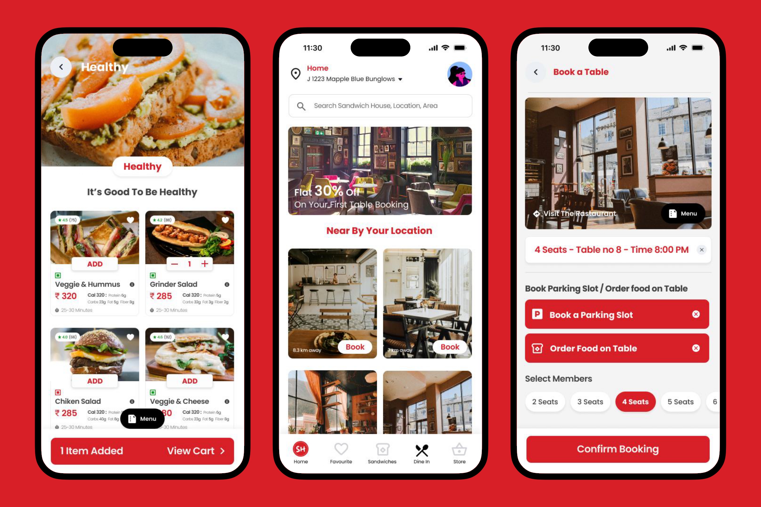
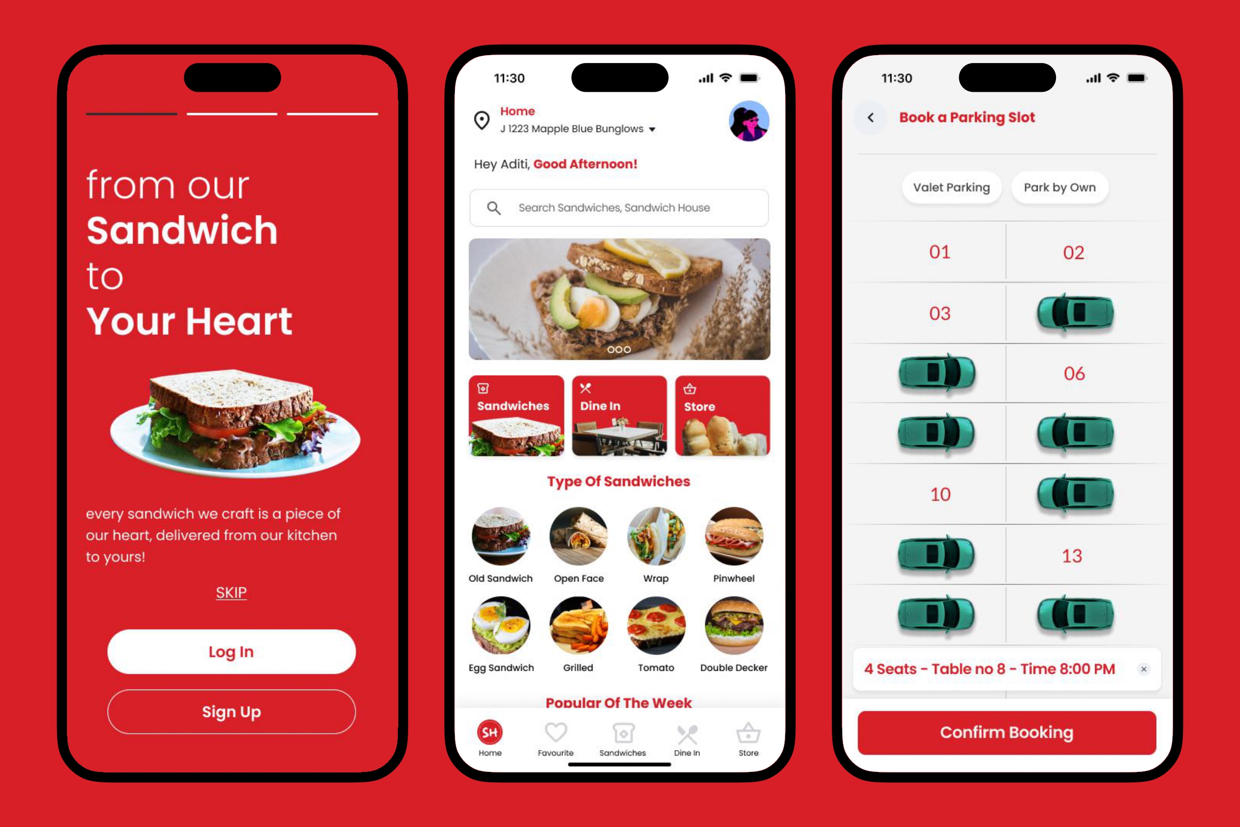
Grounded in extensive research insights, I crafted precise user personas targeting individuals seeking healthy sandwich options, coupled with the capability to effortlessly reserve tables, secure parking spaces, and order food directly to their table. Leveraging these personas, I intricately mapped out user stories to empathize with our user base, thereby guiding strategic product development initiatives. This holistic approach ensures seamless alignment with user needs, fostering elevated satisfaction and sustained engagement with our platform.

User Journey Map

To empathise with the users, we also a created empathy maps and user journey map to dig deeper into each stage that our personas go through while booking a table, parking or ordering food

Competitive analysis

To deepen our understanding and ascertain the potential impact of our app, we conducted a comprehensive competitive analysis. This endeavour enabled us to identify and evaluate existing applications with similar objectives. By leveraging insights gained from this analysis, we aim to refine our UX design approach, ensuring our app addresses user needs effectively while standing out in the competitive landscape

User Flow

After exploratory and market research, I had gotten a fair understanding of the primary user flows for Sandwich House app

Story Board

A storyboard is a sequence of panels or frames that visually depicts and explores a user's journey and interaction with a product

Close Up Story Board
Big Picture Story Board

Paper & Digital Wireframes

I demonstrate skills in both paper and digital wireframes. I use paper sketches to start ideas, and digital ones to create interactive prototypes. This helps me design user-friendly solutions that evolve based on feedback

Wire Frames – Digital

We integrated the insights from usability testing into our digital wireframes, resulting in a representation closely resembling a real app interface. This iterative process enabled us to refine and improve the user experience, ensuring the final product meets user needs effectively.

Usability Study

Round 1

  • Simple and Straight Forward
  • Easily Clickable 
  • To many scrolls while looking into sandwiches on the home page
  • Getting stuck on the VEG and JAIN Toggle button
  • Users desire the ability to view a comprehensive menu directly on the screen
  • Users may face challenges or confusion when attempting to apply coupons during the booking process
  • Encountering difficulties in booking seats and tables during the booking process
  • When booking tables for dine-in, options for parking and ordering food at the table are not available

Round 2

  • Users express a desire for an expanded selection of sandwich choices and detailed descriptions including calorie information for enhanced decision-making.
  • No separate Veg and Jain options
  • Increase text and button size
  • Users seek the ability to access additional options such as table booking, parking booking, or ordering food on the table while engaging with any of these services, with the desire to view the other two options concurrently for enhanced convenience and flexibility

Design System

A design system is a collection of reusable components, guided by clear standards, that can be assembled together to build any number of applications, and the need for them go hand in hand with the need for scale, efficiency, and consistency in Design.

Solution

Leveraging insights from the UI style guide and usability testing, I initiated the development of high-fidelity mock-ups. Emphasising a minimalist approach in the overall user interface design aimed to prevent user overwhelm and ensure a streamlined user experience within the application

Take Away

This project was a fun and fast paced process. In the beginning, I had a long list of potential ideas and features that I wanted to implement. However, as I went through my research and reviewed my data, I realized I didn't need to have so many features because it might overwhelm the user. Once i got to designing, I started to simplify the app to make it easy to use.